Join the Team
We’re Looking for the best talent to join our team.
See the available job positions below
Apply Now...
“Nothing we do is more important than hiring and developing people. At the end of the day, you bet on people, not on strategies.”
See the available job positions below
“Nothing we do is more important than hiring and developing people. At the end of the day, you bet on people, not on strategies.”
Design, Development and Maintenance of Holiday activities booking website for the UK Government.
Sandwell Metropolitan Borough Council (SMBC) needed a dedicated and functional website to promote holiday activities for children and young people across six towns – Oldbury, Rowley Regis, Smethwick, Tipton, Wednesbury and West Bromwich. The Sandwell council focused on providing nutritious meals and fun, enriching activities for children during school holidays.
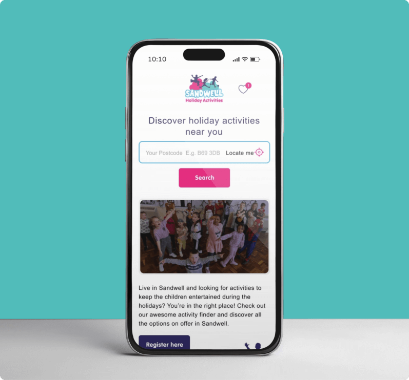
Sandwell MBC wanted a welcoming and friendly tone but an exceptionally functional website. It should allow users to efficiently navigate the website and discover the perfect holiday activity for children and their families. They also emphasised that the website should appeal to a universal audience without stigmatising or targeting families experiencing hardships.
The Sandwell website became live on December 1, 2022, based on clear milestones and under the budget. Within 24 hours, the council received over 150 registrations to attend holiday activities from parents.
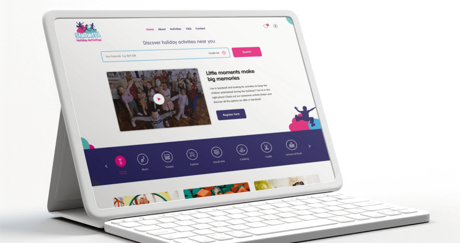
The Sandwell council required over 50 activities to enter into the online directory. During the discovery phase, we identified that a potential online directory website must be user-friendly, clutter and confusion-free, and, above all, must be high performing
In collaboration with the findings, we developed a complete user experience and content strategy efforts and aligned them perfectly with visual design and development. Within two months, we launched the Sandwell Holiday Activities website with a user-focused intuitive web design to offer parents a platform for exploring enriching activities for their children.
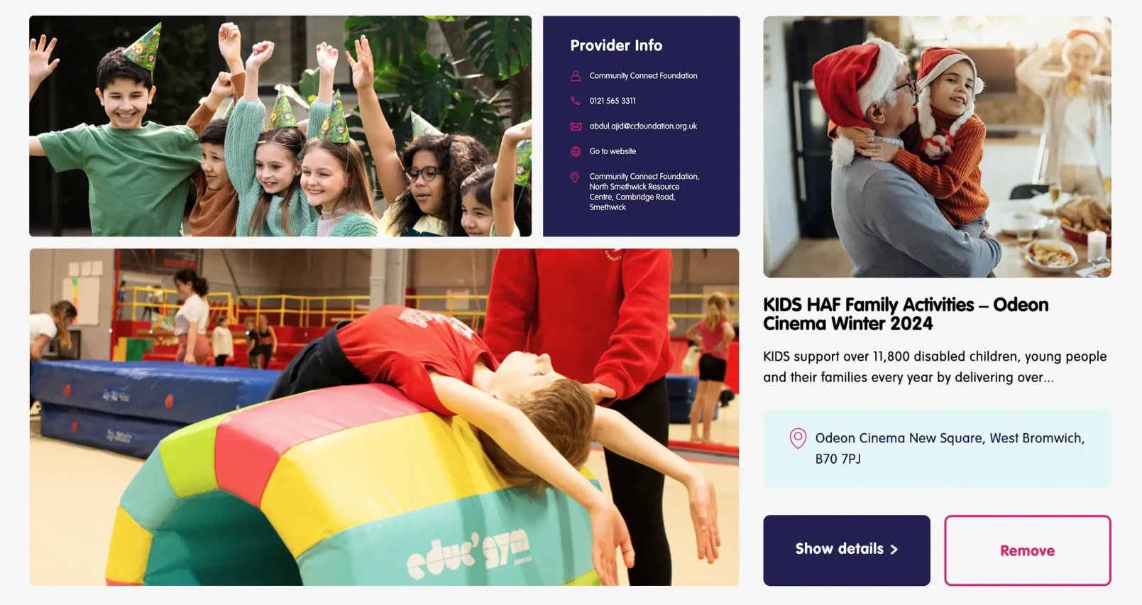
During the discovery phase, our creative team understood the problems users might experience while using the website. So we mapped the step-by-step user journey to resolve their issues. We considered some major points before continuing the project.
We followed the steps below to generate a great user experience and improve the website’s usability.
We implemented white space to make the content more legible while enabling users to focus on elements around the text. White space offered a great feel and freshness for the overall website. We created a special logo using colours and components used from the design to keep the branding consistent with the Sandwell holiday activities.
We created attractive call-to-action buttons (CTAs) while thinking about the colour, message and colour psychology to evoke user trust and experience. We tested facets of colour variations and action messaging to trigger users to take action. As a result, we achieved a 10% increase in the registrations on the website. Our action-oriented buttons and activity listings on the home page enhanced the user experience and made the user journey easy. It also prompted users to register activities, and the Sandwell council yielded more bookings.
Our SEO content writers included relevant keywords for targeting potential audiences by constructing well-designed headings to stand out and improve searchability. It guides the users to scan the website and find the right content they are searching for. The titles curated by our writers are consistent, stand out in size, font, and colour and describe the content precisely
We ensured consistency between web pages by matching heading sizes, colours, fonts, button styles, spacing, illustrations and design attributes. These inputs improved the quality of designs and users’ trust. It also provides the user’s bespoke and memorable experiences to surf the website.
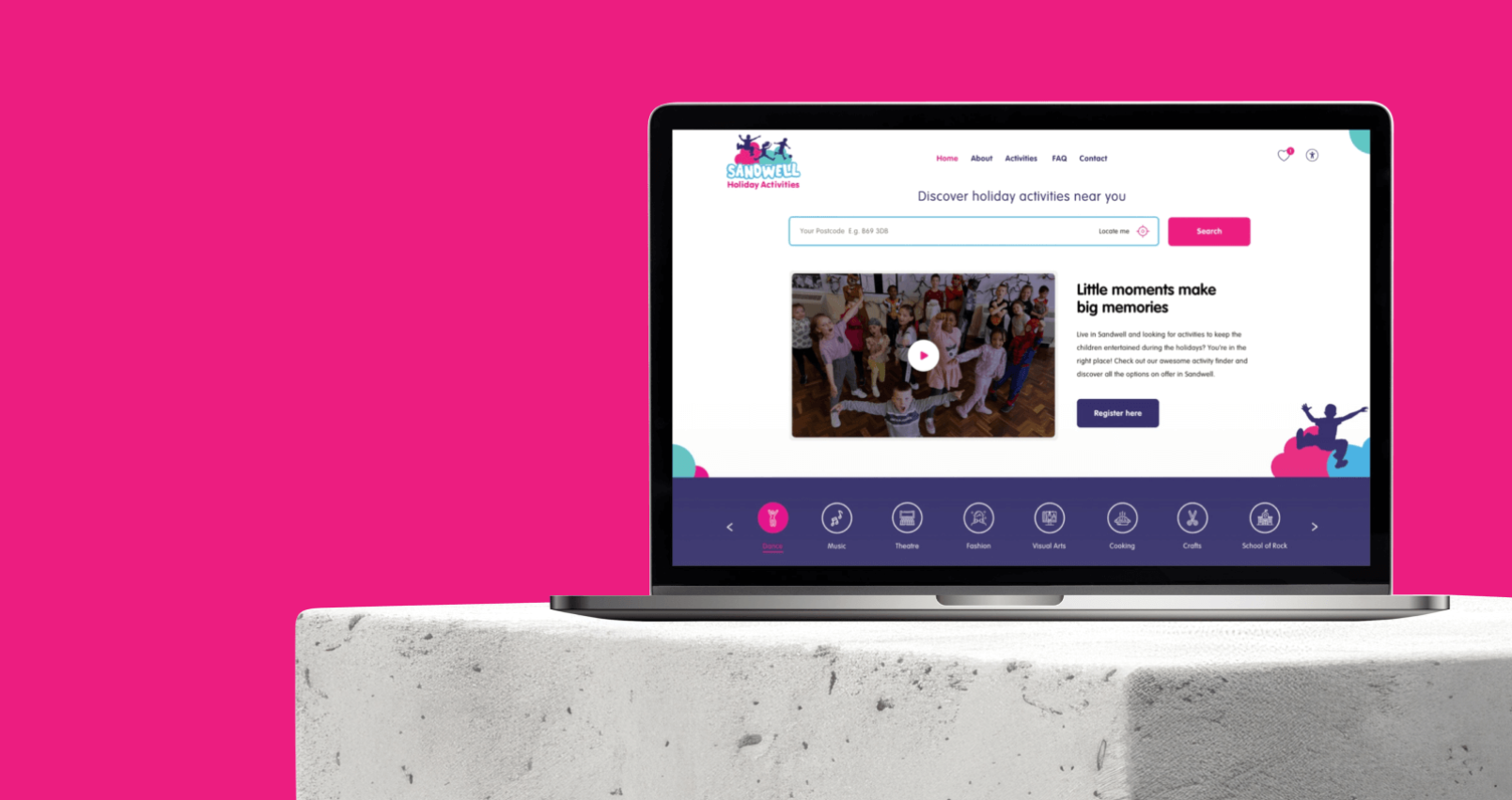
We needed to streamline the content for visitors by creating a clear content strategy. Using the UK content style guide, we simplified the goals and aimed for a consistent voice and tone to make parents, kids and young people trust, be confident, included and valued in attending enriching holiday activities. We wanted the content to be written in simple and plain English using British spelling and grammar.
Our content curators focused on writing consistent and easily scannable content for readers using mobile devices. We always tried to communicate in an active voice to make it clear and understandable for the target audience. We conveyed the website message successfully in a friendly and welcoming tone based on the core values of Sandwell.
Our web designers led a visual design discovery process to help users engage and build trust and interest in the brand. The visual design process revolves around website aesthetics by strategically implementing images, colours, fonts and other design elements. We were open to sharing ideas, concepts and perspectives with the council for a collaborative design process. It offered insights into branding preferences, established a shared vocabulary and motivated us to align with the project vision and design phase.
With visual design discovery, we could establish a crystal clear design consistent with the Sandwell organisational goals for transforming the website for a global audience. Our diligent effort in research, user journey mapping, user experience and content strategy offered significant value in the success of the Sandwell project.
From typography and colour palettes to design patterns, our web designers brought life to the website by co-existing with Sandwell’s core values: giving value to all, creating fun in activities, offering a range of new activities, trusting all activities, feeling welcomed, happy and valued.
Designers primarily focused on presenting high-priority web pages beginning with the homepage designs. We regularly checked and reviewed the web page design between the teams and with the council. We continuously refined the web design to ensure feasibility with the Sandwell council’s perspectives and improve the overall website experience for users.
Sweans understand accessibility from the ground up and are committed to making the journey to accessibility easier, faster and more successful. Our engineering team works collaboratively to improve accessibility by removing barriers and giving equal access to information, particularly for Persons with Disabilities (PwDs).
We are part of developing accessible websites for future generations. We don’t simply understand accessibility. We make it work for you by ensuring all elements are cohesive by continuously testing for speed, usability and accessibility.
To make a website accessible, we must put people of all abilities at the centre of the process to implement solutions. We incorporate state-of-the-art practices using cutting-edge technologies to ensure accessibility across multiple platforms. With the help of our experienced web development team and test engineers, we identify accessibility issues and run accessibility testing regularly as part of the rapid development routine. We combine accessibility and usability to increase ease of use for everyone.
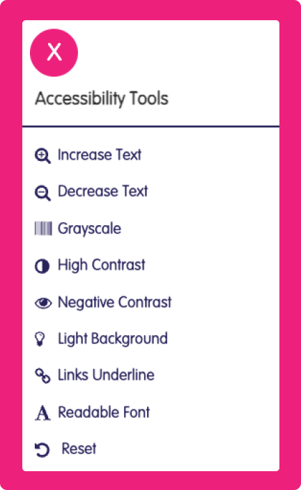

Using the latest screen reader versions of NVDA, JAWS and VoiceOver, we conduct effective screen reader testing on the web content and offer a more accessible website experience for all your website visitors. We use screen readers to test our pages manually. Regular screen read testing is an effective method for checking any issues on your web pages. If there is a video, we refine closed captions and check elements like colour contrast, headings, buttons, lists and navigation.

We use keyboard accessibility testing to navigate the page, including all menus and interactive elements without using a mouse. We ensure that a disabled person can navigate your website with a keyboard.
At Sweans, we consider accessibility right before we think about a solution. Our team is on a consistent mission to ensure that the websites are perceivable for a wide demographic. We found an efficient and authentic approach to have usability and accessibility as common factors in the web development process. We closely listen to users rather than designing the website first and questioning second. We get in-depth insights into how our users look while searching for information or services.
With engineers detecting accessibility flaws and designers crafting the website using effective font styles and colour contrast, we designed and developed the Sandwell website partially compliant with WCAG 2.1 level AA standards.
We aimed for WCAG 2.1 level AA standards but could not pass AA standard criteria due to noncompliance with two guidelines linked to contrast. However, there are no crucial errors for common users. We could have resolved the issue if the design strictly adhered to WCAG 2.1 level AA standards.
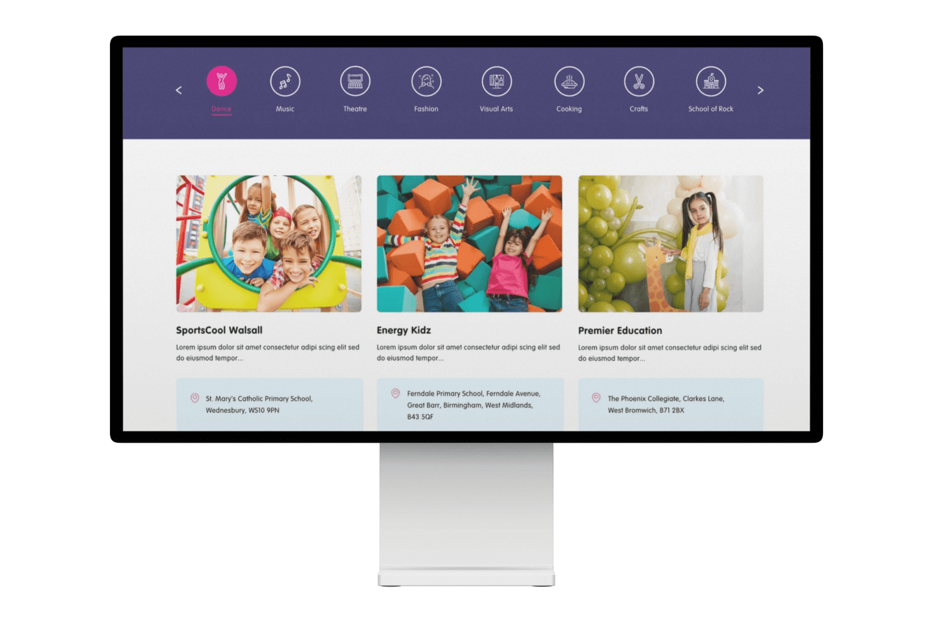
Our Search engine optimisation (SEO) efforts began with a comprehensive SEO audit for the top web pages of the Sandwell website. The audit enabled us to gain insights into SEO challenges and opportunities and generate a mapping for our SEO team.
We collaborated with content strategists and the SEO team to create unique, relevant and informative title tags and meta tags for all the web pages on the Sandwell website. We had a deep understanding that titles and meta descriptions positively impact the search engine rankings and organic traffic to the website.
We used Google guidelines to write the best alt texts, which are relevant, information-rich and meaningful. Most importantly, we avoided filling alt attributes with keywords (commonly known as keyword stuffing). We double-checked images uploaded have well-defined alt tags and file names.
Our team held online meetings with the client to answer all their queries and concerns. We offered support and training on state-of-the-art practices, content management and elementary website maintenance guidelines. The ongoing website training allowed the Sandwell council to empower themselves by taking responsibility and making necessary content tweaks for their latest WordPress website.
In tandem with Sandwell council, we delivered a visually aesthetic and friendly website enabling users to register interested activities seamlessly. We could create new digital experiences to help users identify holiday activities based on the user’s current location. We embraced the latest technology and best practices to improve the website performance, support and train Sandwell staff.
After the website launch, Sweans posted the Sandwell designs on social media, which received favourable and encouraging responses. Everyone remarked that the website design helped users find the information quickly and navigate the site more comfortably. We also received feedback that the content is crisp, transparent and easier to understand for the target audience.
Our creative team worked diligently to create a fully functional website for Sandwell council to showcase over 50 holiday activities. Our designers generated a child-centric design to reflect and support the child-based persona loved by kids of all ages, young people and parents. Our design attributes are welcoming, fun-filled and strictly adhere to extensive demographics. We created a bubble effect inspired by the Sandwell logo concept to design the six activities listed on the homepage.
We built the Sandwell Holiday Activities on WordPress CMS based on the guidelines given by the council. The council emphasised that the website must include a location-aware option. This feature automatically detects the location of users who grant permission for the website to access their location data. It will enable the website to filter results based on the user’s location without requiring additional user interaction. Our web developers did remarkable work in developing the high-octane website within a short time.
Another daunting task was to enter numerous activities, images and descriptions into the website. But with perseverance and hard work, our team successfully removed the bottlenecks and completed the work meticulously.
Sandwell MBC had a new, user-intuitive, welcoming and friendly website aligned with their branding perspectives. We ensured website accessibility for all users and abilities on desktop, mobile devices and the latest browsers. The users could easily navigate and explore the activities the children and families might be interested in and spend their holidays. As an outcome, there were over 150 registrations for holiday activities within the first 24 hours.